Introduction
This article describes
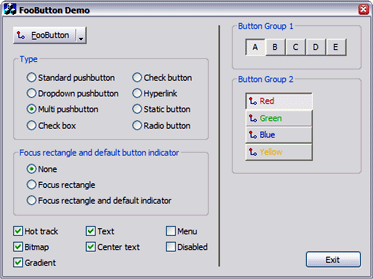
FooButton, a lightweight owner-drawn button class that's served me well for several years. Although there are plenty of other
excellent button classes at CodeProject, I thought I'd add this trusty friend to the pile in the hope that someone may find it equally useful.

Features
FooButton lets you use a vanilla
CButton as a:
- standard pushbutton
- pushbutton button with a drop-down indicator
- multi pushbutton (like IE's "Back" and "Next" buttons)
- checkbutton
- hyperlink
- static text control that's responsive to mouse clicks
- check box
- radio button
Support is also provided for:
- bitmaps (currently only 16-color)
- left-justified, centered and multi-line captions
- colored captions
- gradient shaded button backgrounds
- popup menus
- hot tracking
- optional focus rectangle and "default button" indicator
- grouped checkbuttons
How to use FooButton
- First, associate a standard button control (eg:
IDC_FOO_BUTTON) in your dialog with an instance of the object.
 Collapse | Copy Code Collapse | Copy Code #include "FooButton.h"
...
FooButton m_fooButton;
 Collapse | Copy Code Collapse | Copy Code void CMyDialog::DoDataExchange(CDataExchange* pDX)
{
CDialog::DoDataExchange(pDX);
DDX_Control(pDX, IDC_FOO_BUTTON, m_fooButton);
} |
- Then, initialize the instance in your dialog's OnInitDialog() method to suit your needs. In this example, the button is set to display a bitmap and a drop-down indicator.
 Collapse | Copy Code Collapse | Copy Code m_fooButton.setBitmapId (IDB_FOO_BUTTON);
m_fooButton.setType (FooButton::Type::pushButtonDropDown);
|
 |
API
| Method |
Purpose |
getType(), setType() |
Gets and sets the button's type |
getTextStyle(), setTextStyle() |
Gets and sets the button's text style |
getTextColor(), setTextColor() |
Gets and sets the button's text color |
getFocusStyle(), setFocusStyle() |
Gets and sets the button's focus style |
getGradient(), setGradient() |
Gets and sets the button's gradient property |
getBitmapId(), setBitmapId() |
Gets and sets the button's (optional) bitmap id | |
displayPopupMenu() |
Displays a popup menu below the button |
isChecked(), check() |
Gets and sets a checkButton's checked state |
isMultiClicked(), clearMultiClick() |
Gets and resets a multiPushButton's multi-clicked state |
addToGroup(), removeFromGroup() |
Adds/removes a checkButton to/from a button group |
reset() |
Frees storage used by all button groups | |
Using FooButton as a check button
You can freely change any property of the button at run time. This code snippet turns the button into a checkbutton and checks it. Use
check() and
isChecked() to set and retrieve the button's checked state.
 Collapse | Copy Code Collapse | Copy Code m_fooButton.setType (FooButton::Type::checkButton);
m_fooButton.check (true);
ASSERT (m_fooButton.isChecked()); |
  |
Gradient shading
Pushbuttons and checkbuttons can be set to display a gradient shaded background by calling
setGradient(). This method has no effect if the button isn't a pushbutton or checkbutton.
 Collapse | Copy Code Collapse | Copy Code m_fooButton.setGradient (true); |
 |
Button groups
You can make a bunch of
checkButtons behave as mutually exclusive radio buttons by adding them to a button group. A button group is just a named collection of buttons.
FooButton automatically handles group creation, membership and cleanup.
 Collapse | Copy Code Collapse | Copy Code m_btnSmall.addToGroup (_T("foo"));
m_btnMedium.addToGroup (_T("foo"));
m_btnLarge.addToGroup (_T("foo"));
m_btnXLarge.addToGroup (_T("foo")); |
 |
Displaying a popup menu
To display a popup menu in response to a button click, call
displayPopupMenu(). You can call this method for any type of
FooButton.
 Collapse | Copy Code Collapse | Copy Code void CMyDialog::OnFooButton()
{
CMenu menu;
menu.LoadMenu (IDR_POPUP_MENU);
CMenu* pPopupMenu = menu.GetSubMenu (0);
int nResult = m_fooButton.displayPopupMenu (pPopupMenu);
if (0 != nResult)
PostMessage (WM_COMMAND, nResult);
} |
  |
Multi-pushbuttons
A multi-pushbutton behaves as two buttons in one, similar to IE's "Back" and "Next" buttons. When the user clicks the button's drop-down region,
FooButton sets its "multi-clicked" property to
true. You can query this property by calling
isMultiClicked(). Regardless of whether the user clicked in the button's main or drop-down region, a standard notification is sent to the parent. To clear the button's multi-click property, call
clearMultiClick().
 Collapse | Copy Code Collapse | Copy Code void CMyDialog::OnFooButton()
{
if (m_fooButton.isMultiClicked()) {
CMenu menu;
menu.LoadMenu (IDR_POPUP_MENU);
CMenu* pPopupMenu = menu.GetSubMenu (0);
int nResult = m_fooButton.displayPopupMenu (pPopupMenu);
if (0 != nResult)
PostMessage (WM_COMMAND, nResult);
m_fooButton.clearMultiClick();
} else {
PostMessage (WM_COMMAND, IDC_DEFAULT_ACTION);
}
} |
  |
Check boxes and radio buttons
You can make a
FooButton appear as a standard check box or radio button by using the
FooButton:Type::checkBox and
FooButton:Type::radio types. Of course, this is really only useful when you want to also display a bitmap or add menu support to the button.
 Collapse | Copy Code Collapse | Copy Code m_fooButton1.setType (FooButton::Type::checkBox);
m_fooButton2.setType (FooButton::Type::radio);
|
  |
Hyperlink button
A hyperlink button is just a regular button that renders itself as a hyperlink. You can navigate to a URL or perform any other action in the button's handler.
 Collapse | Copy Code Collapse | Copy Code m_fooButton.setType (FooButton::Type::hyperink);
|
 |
Text color
You can change the color of the button's text at any time by calling
setTextColor(). The text of hyperlink buttons is always rendered in
C_HyperlinkColor and that of disabled buttons is always rendered in the standard etched format.
 Collapse | Copy Code Collapse | Copy Code m_fooButton.setTextColor (RGB (192, 0, 0));
|
 |
Focus rectangle
By default, a
FooButton doesn't display a focus rectangle. Call
setFocusStyle() with
FooButton::Focus::normalFocus to enable the button to display a focus rectangle.
 Collapse | Copy Code Collapse | Copy Code m_fooButton.setFocusStyle (FooButton::Focus::normalFocus); |
  |
Default button indicator
To enable a default
FooButton to display its standard dark border, call
setFocusStyle() with
FooButton::Focus::defaultFocus.
 Collapse | Copy Code Collapse | Copy Code m_fooButton.setFocusStyle (FooButton::Focus::defaultFocus); |
  |
Rendering disabled bitmaps
Use the standard MFC
EnableWindow() API to enable and disable the button.
FooButton uses its original bitmap to render a disabled version.
 Collapse | Copy Code Collapse | Copy Code m_fooButton.EnableWindow (TRUE); m_fooButton.EnableWindow (FALSE); |
  |
Acknowledgement
Revision history
7 Oct 2006
- Bug Fix:
m_hMsimg32 should be set to NULL in destructor. (Thanks, C. Young!)
- Bug Fix: Memory leak in
DisabledBlt(). (Thanks, Corrado Valli!)
6 Mar 2005
- Bug Fix: Added definition of
COLOR_HOTLIGHT to enable compilation on older systems.
5 Mar 2005
- Enhancement: Added support for gradient shaded buttons.
- Bug Fix: Reusing a group name across dialog invocations would cause a crash in
FooButton::removeFromGroup().
19 Feb 2005
- Enhancement: Added support for colored captions.
- Enhancement: Removed requirement to call
FooButton::reset() when your app terminates.
- Enhancement: Now uses standard Win2000/XP hyperlink cursor.
- Enhancement: Code now
ASSERTs if you're not subclassing from a button control.
- Bug Fix: All calls to
Invalidate() now validate window handle, allowing a FooButton to be safely destroyed when clicked.
Fixed typo in default state rendering logic
17 Jul 2004
- Added support for check boxes and radio buttons
- Fixed typo in default state rendering logic
11 Jul 2004
- Optimized fix for "unreferenced identifier" compiler warning
- Exposed focus rectangle and default state modes
- Added support for button groups
4 Jul 2004
Added multi-pushbutton and hyperlink styles.
3 Jul 2004
Submitted to CodeProject.
12 Sep 1998
Initial version.
License


 FooButton_demo.zip


댓글